Create a Pie Chart
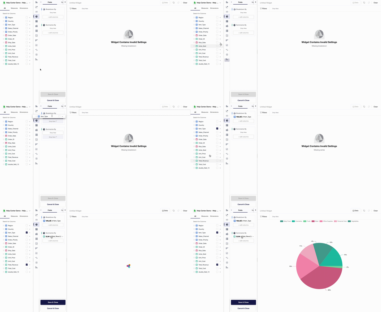
Pie charts are great for displaying proportions. Pie charts apply aggregate functions to measures and break them down into categories. To create a pie chart, follow the next steps:
- In the widgets menu, click on the pie chart icon.
- Drag and drop a dimension, based on which a pie chart will create categories, into Breakdown By.
- Drag and drop a measure into Summarize By.
- Choose aggregate functions by clicking on SUM and / or Value.

Widget-Level Settings
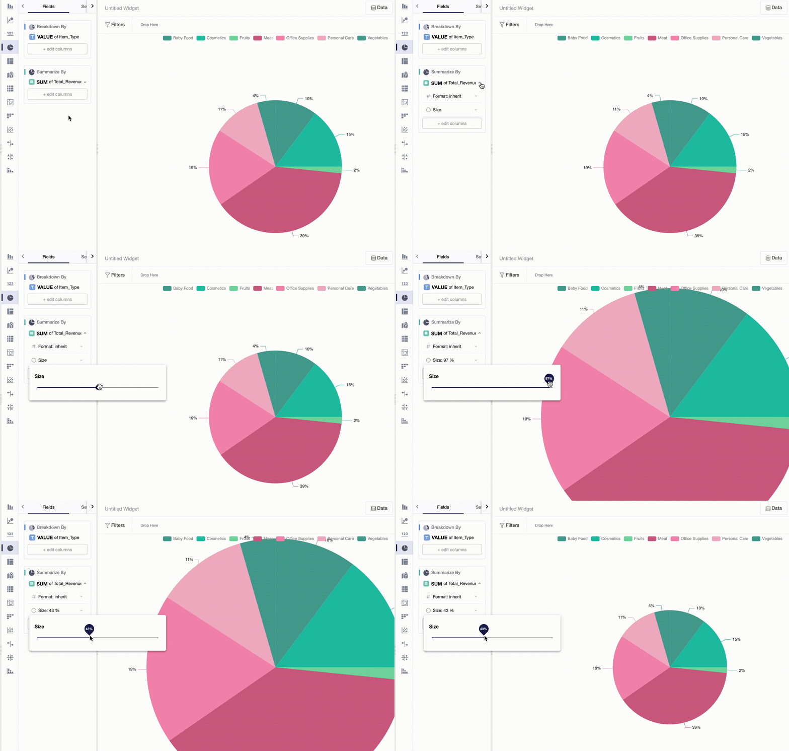
Currently, Y42 app supports several settings for pie charts. For example, you can change the size of your pie chart. To do so, click on a variable in Summarize By and choose Size.

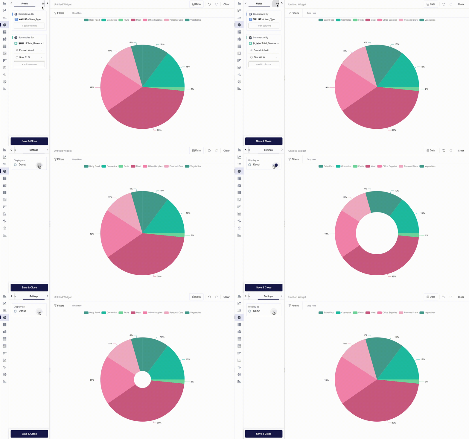
If you would like to turn your pie chart into a donut, you can simply go to Settings and turn on Donut regime:

Updated over 3 years ago