What are Y42 Visualizations?
A short introduction to what you can expect from the Y42 Visualizations product.
What are Y42 Visualizations?
The Y42 Visualizations product enables every data analyst and business user who uses Y42 to easily consume, create & share beautiful, trustworthy, and fast insights which create value for their organization.
How do I use Y42 Visualizations?
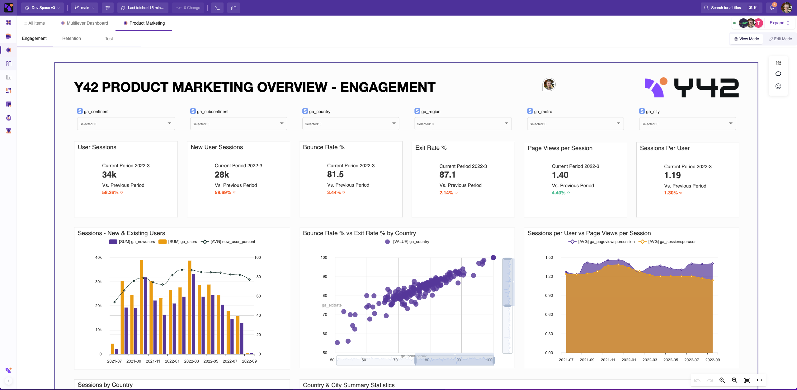
As a Data Analyst, you use Y42 Visualizations to create charts (we call them widgets) inside dashboards, to tell a story which you can then share with your business users. The data to build the charts comes from tables generated by Y42’s Integrations and Model products. If you work in a team, you can use Y42 Visualizations to collaborate with the power of a developer - working in separate branches, reviewing each other’s work, and merging your work back to a central location.
As a Business User, you use Y42 Visualizations to consume charts in order to generate insights about the past present and future state of your organization. You can dig further into these charts to see the underlying data or with our advanced filtering capabilities, and with our collaboration tools you can just as easily ask questions to your Data Analysts as you can flag interesting insights to colleagues.
What does the workflow for using Y42 Visualizations look like?
As a Business User, your entry into Y42 Visualizations will be in one of two ways:
- Indirectly, with sharing links received via Email or Slack, taking you directly to a dashboard or chart
- Directly, from the Visualizations area of our app, where you can star or set up custom folders for your favorite insights.
You can then consume insights, dig further into the data, and collaborate with colleagues. Over time, the Y42 product will aim to create a data habit amongst your team, to foster a data driven culture and make sure that usage is not isolated to only a certain few business leaders.
As a Data Analyst, Once you have imported data into Y42 with our Integrations product and transformed it using our Model product, you can set up a dashboard and create your first widgets.
From there on, you can create visually appealing dashboard layouts with preset or custom themes and apply the finishing touches with images, shapes and text.
Later, once the first dashboards are set up, you will work on tasks in your own branch in git, pushing changes back into the main branch once they are ready. You will also review team-mates’ work, whilst responding to business users’ requests from directly within the app.
What makes Y42 Visualizations so powerful?
The Y42 Visualizations product differentiates itself in 2 principal ways:
Collaboration:
- Data Analysts can seamlessly collaborate with Data Engineers due to the all-in-one nature of Y42. This makes the data team far more nimble - able to understand the exact source of the data without needing to ask, and make small adjustments in each other’s workspaces when needed. In the end - rather than taking a week to create a dashboard for which the data isn't perfectly ready, it can take a day!
- Data Analysts can work together with other Data Analysts in the same tool with the power of a developer using our git architecture.
- Data Analysts work in the same tool that Business Users consume
- Business Users can easily share insights with other team-mates, with simple collaboration features such as comments and sharing for now, and far more to come.
Trustworthiness/ Transparency:
- Y42 Visualizations show in every chart the full history of how the data reached it’s current state. No more ‘I don’t trust this number’ from Business Users - they can see for themselves how it was calculated and precisely when it was last refreshed.