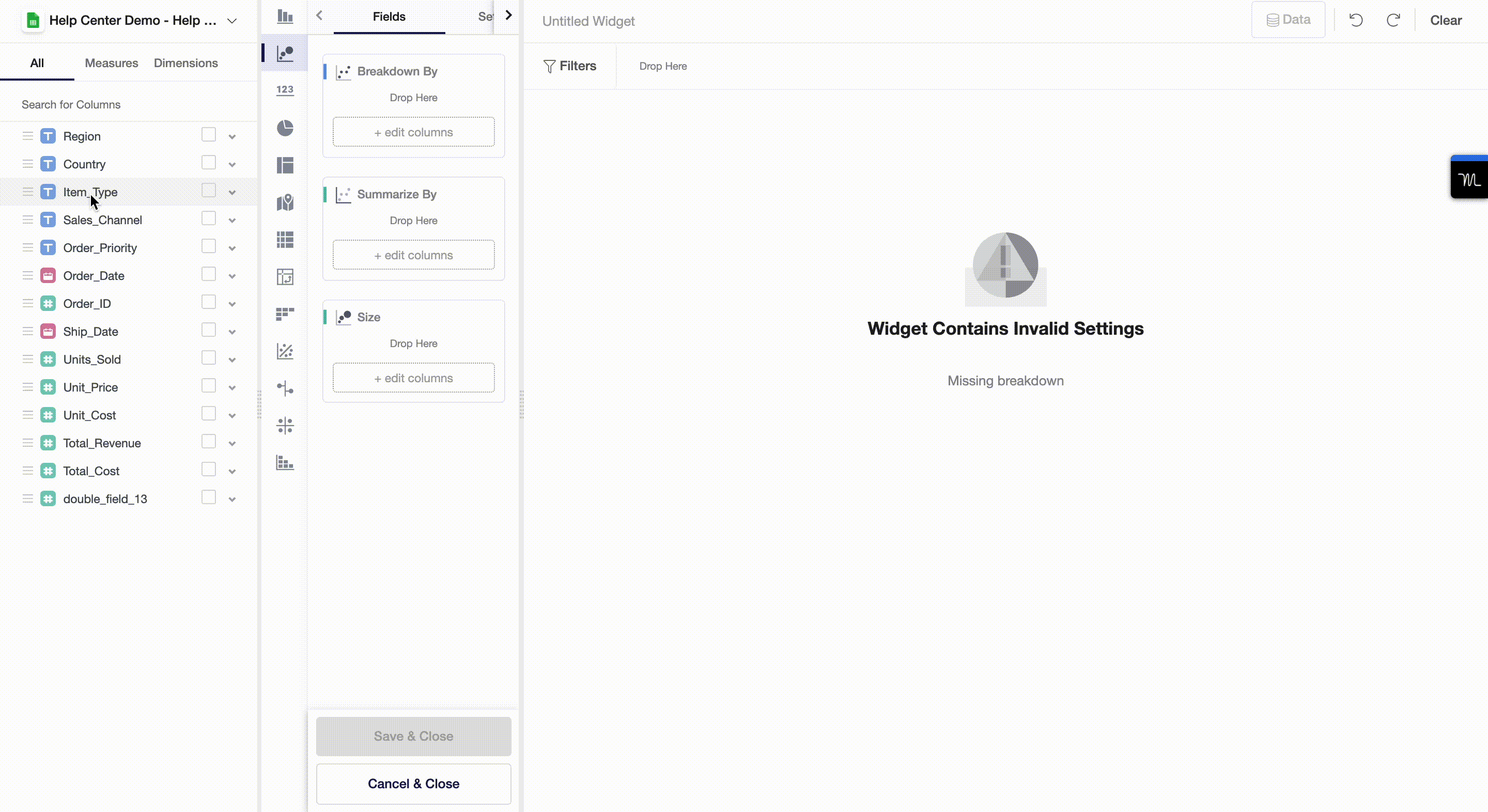
Create a Scatter Plot
A Scatter plot is a visualization widget that shows relationships between numerical variables. In the Y42 platform, a scatter plot may take more than 2 dimensions, which will help you to communicate more complex data.
You can create a simple scatter plot by following the next steps:
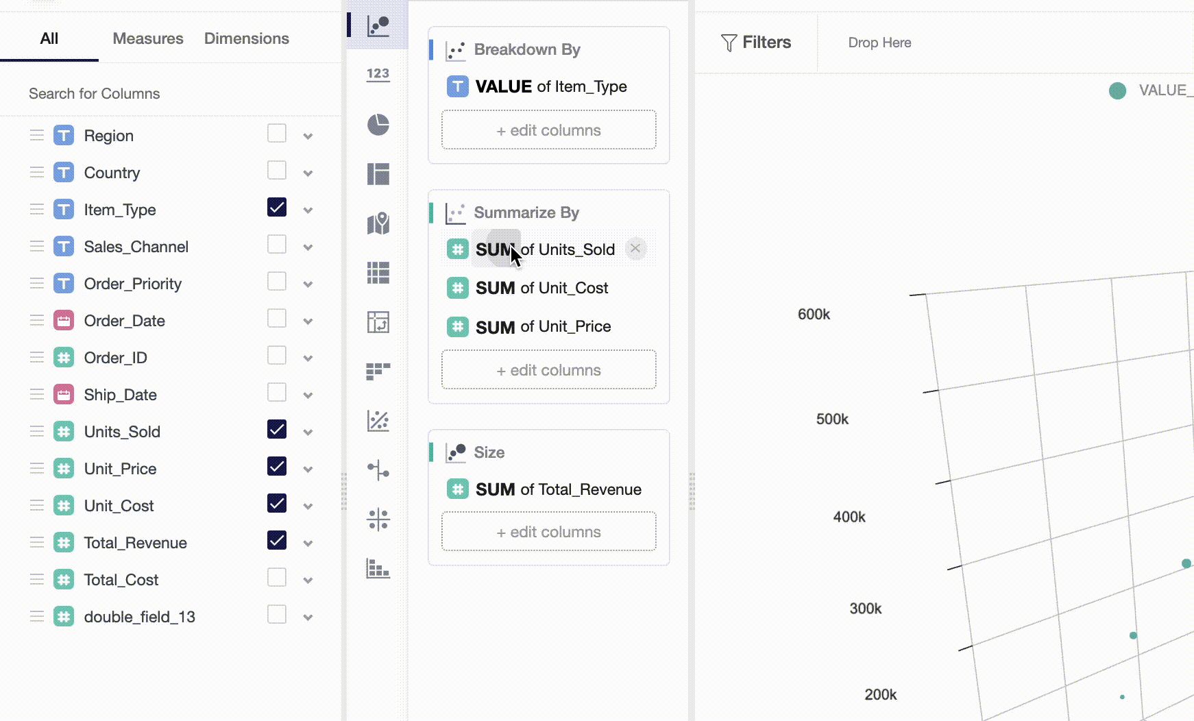
- Drag and drop a dimension variable to Breakdown By. This will determine how many circles a widget will contain.
- Add measures to Summarize By, where each measure corresponds to a separate axis. Add 2 to 3 measures to reveal relationships between variables broken down by dimensions you set in step 1.
- Add measures to Size , this will increase or decrease circle sizes.
In our example, we show relationships between costs, prices and units sold broken down by item types. Our scatter plot also shows in relative terms how much total revenue items of each type bring to a store: the bigger the circle, the more revenue the store gets.
Variable-Level Settings
There are two different setting types that you can apply to variables used in a widget: aggregate functions and appearance.
Aggregate Functions
Aggregate functions greatly depend on the variable type: numeric, dates, categorical. To change an aggregate function, simply click on bold text as shown below:
Currently, numeric variables support the following functions: sum, average, minimum, maximum, count, and distinct count. Categorical variables only support value for dimensions, count and distinct count for measures.
Widget-Level Settings
In Settings, you can change how axes look through changes in name, margins, fonts and other appearance options.
Filters and Underlying Data
On a widget level, users can also set particular filters by dataset variables. To do so, you can drag and drop variables from the measures and dimensions field and then apply a filter to the variable you chose.
By clicking on Data , you will get a preview of the data used to build a widget.
Updated almost 4 years ago