How to create charts out of your queries
How to create charts out of your queries.
Once you click a single table, the data will appear in the right in a tabular form. This data should be the same as your last committed output of this table in the output node.
You have the possibility to add charts in the Preview of Integrations, SQL models, Ui-Models.
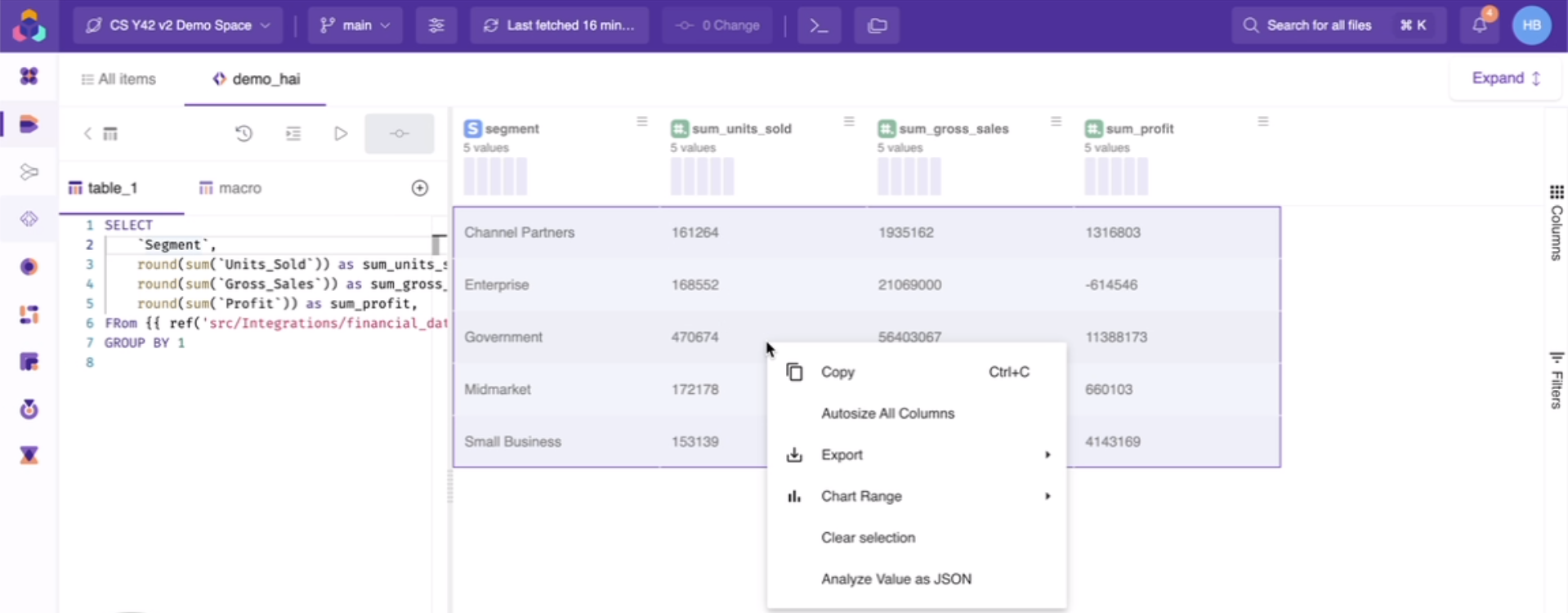
In this data set you might perform analytics right form here by right clicking anywhere inside the data set:
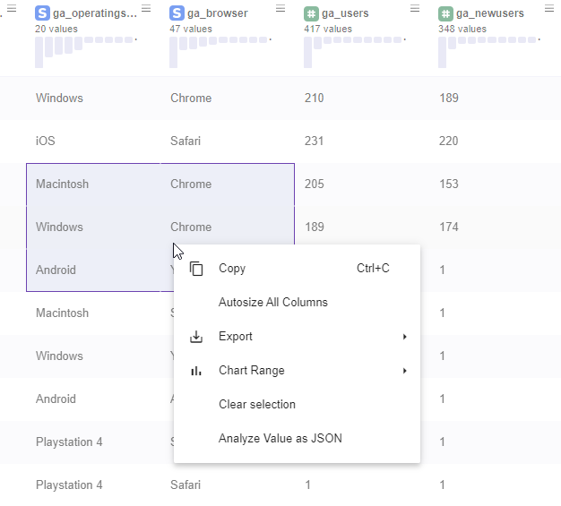
The following options now are available:
- Copy→ Copies the single cell text you right clicked into.
- Autosize all columns→ Expands the columns horizontally so the text inside cells is easily visible.
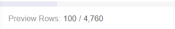
- Export in CSV or Excel → Exports the table into CSV or Excel into your local computer. Important Note: This action will only export the preview of you dateset not all the columns. In order to export all the rows you would need to scroll down until the preview reaches the total number of rows. By default Y42 previews only the first 100 Rows:
- Chart Range → It will display the data set into a chart you choose. You just need to select the area that will serve as a data source for your chart and then right click inside the selected area.
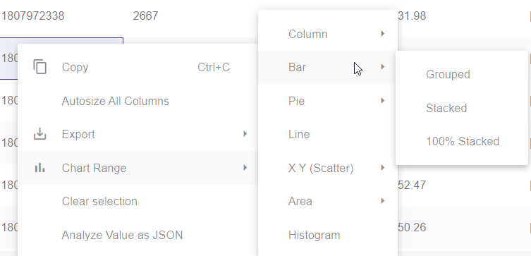
You might choose a variety of chart types as displayed in the screenshot above.
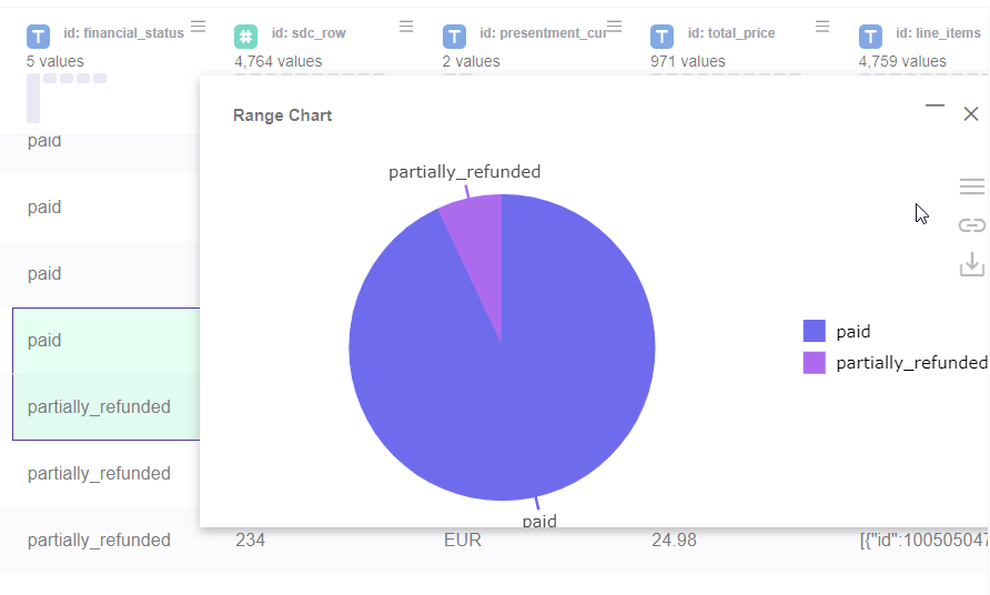
When you hover to the chart, the following actions are possible:
Menu → offers other chart possibilities for your selected area
Link/Unlink Grid → Shows the selected data this chart uses.
Download Chart → Downloads the chart as an image (PNG)
Zoom in/Zoom out → The horizontal line near the close button when clicked zooms in and zooms out the chart
Close→ Closes the Chart
- Clear selection → Clears the selection of the data previously made
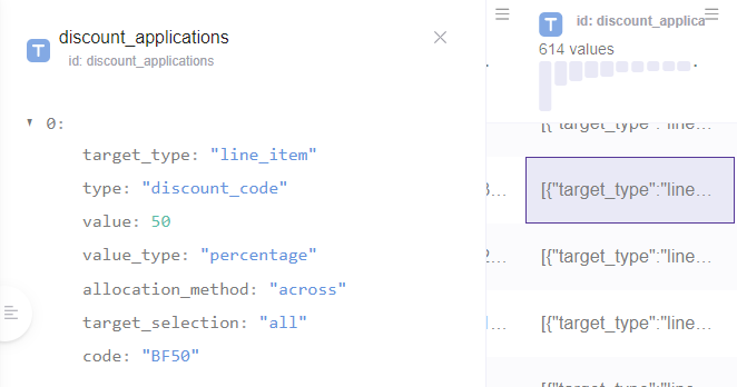
- Analyse value as JSON→ Outputs the data of the JSON in a formatted form:
Columns Section.
By clicking the columns we have the possibility to group the data by column. You can also remove the columns you do not need, this way your data are cleaner for your analysis.
After you click the column button all the columns will display in a menu bar in the right. if you want to group by the data simply drag the column you want into Row Groups (do so by clicking the two horizontal lines near the column name).
If you want to remove Values you can do so by clicking the X sign.
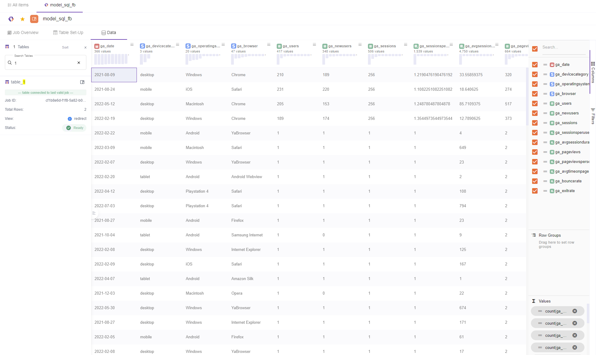
Filters Section.
When clicking filters button all the columns will display in a menu bar in the right. You might want to filter the column data, without needing to scroll horizontally (when you have too many columns) to find the column you need to filter out. That is when the vertical column listing comes in rescue.
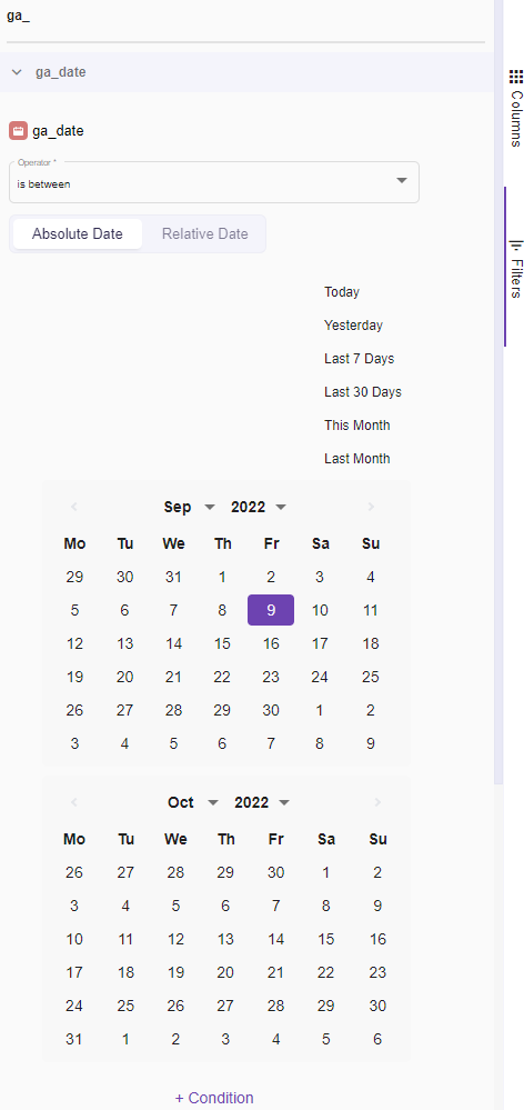
Simply click on the column you need to add a filtering criteria and add the condition.
Updated over 3 years ago