Create a Simple Chart (Bar/ Line/ Area)
Simple Bar, Line & Area charts allow you to compare data across multiple categories. Follow these steps to build a simple chart:
- Drag and drop measures to Summarize By.
- Add dimensions to Segment By and Breakdown By.
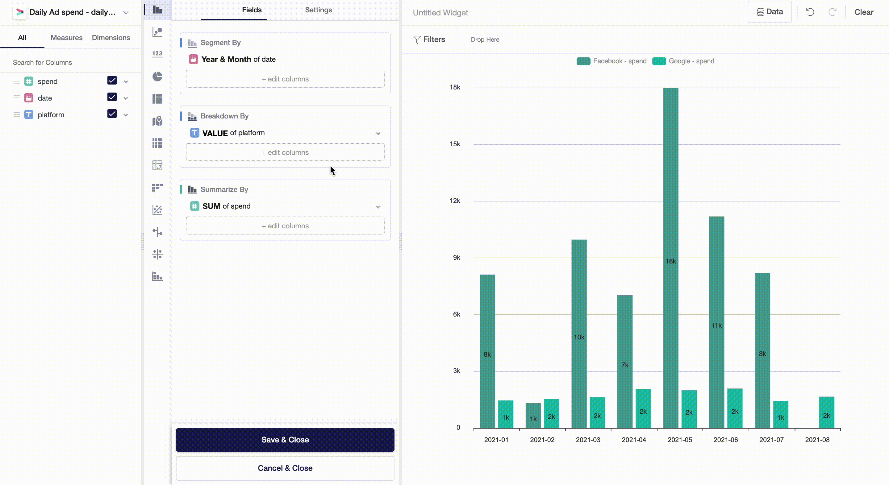
- Segment By - Summarizes measures by categories. In our example, we segmented a numeric variable, Spend, by Year & Month.
- Breakdown By - Splits measures within each segment by other categories. In our example, for each combination of Year & Month, we break down spend into two groups - Facebook and Google.
Variable-Level Settings
There are two different setting types that you can apply to variables used in a widget: aggregate functions and appearance.
Aggregate Functions
Aggregate functions greatly depend on the variable type: numeric, dates, categorical. To change an aggregate function, simply click on it as shown below:
Appearance Settings
Breakdown By
In Breakdown By, you can turn a simple bar, line or area chart into a stacked one, where each dimension doesn't have a separate bar anymore but rather is stacked on top of each other. It is also possible to normalize a breakdown by stacking it to 100%:

Summarize By
In Summarize By, you can find settings that are applied to or created based on measures. Below, we will describe each of them in detail.
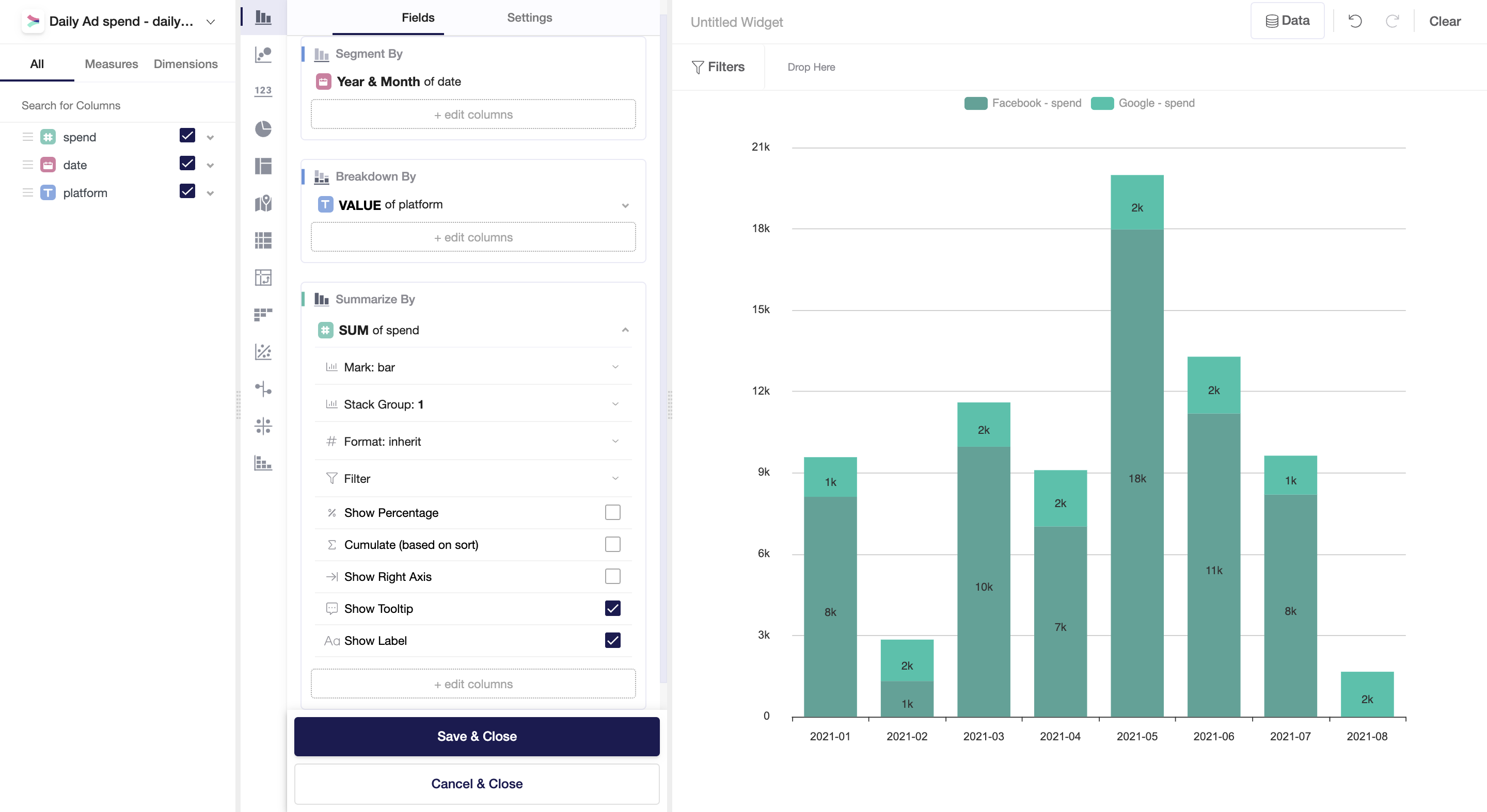
- Mark: bar, line, or area.
- Stack: settings for group stacks.
- Format: change how your numbers are displayed - rounding, separators, negative values, and currency.
- Filter: you may apply filters based on the same variable as used in Summarize By or any other variable you have in a dataset.
- Show percentage: display numbers in relative terms. Note that a chart will display the percentage of each breakdown value out of the total value taken as 100%.
- Cumulate: cumulative values based on the sort. In our case, based on dates.
- Show right axis: you may want to add a second axis in case your measures differ significantly in absolute terms across breakdowns: imagine that "Facebook spend" includes millions and "Google spend" - just hundreds. Adding a second axis will help to communicate data clearer.
- Show tooltip: a tooltip is a pop-up window that appears once you place a cursor on a bar. It shows more detailed information about the data behind a chart.
- Show label: labels are numbers that appear on bars.
Widget-Level Settings
In Settings, you can change the appearance of a widget. This includes:
- Legend: show names of Breakdown By categories and corresponding colors.
- Flip Axis: turn a horizontal bar chart into a vertical one and vice versa.
- Axis Pointer: axis pointer shows numbers on the existing axes. This feature is especially helpful for large charts and charts with double axes.
- Sorting: sort bars in descending or ascending order by measures or dimensions.
- X- and Y-Axis: change the appearance of axes: rotate category names, change the font and its size, adjust margins, etc. You can also perform a log-transformation of values.
- Data Zoom: choose an interval of values that you would like to analyze separately.
Filters and Underlying Data
On a widget level, users can also set particular filters by dataset variables. To do so, you can drag and drop variables from the measures and dimensions field and then apply a filter to the variable you chose.
By clicking on Data, you will get a preview of the data used to build a widget.
Updated almost 4 years ago