The widget editor is an interface which allows users to create and edit widgets (charts and tables). This article describes the functionality of the widget builder that allows users to select data to create those charts and tables.
Filter fields available for selection
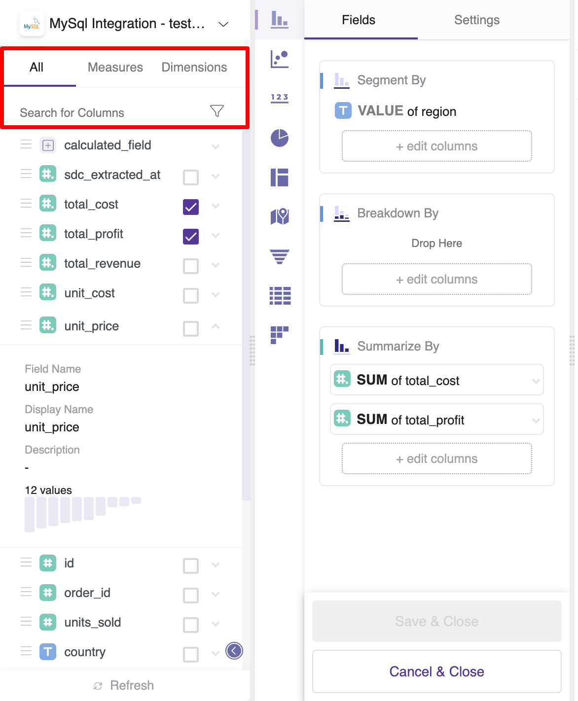
All
Show all columns that can be used for visualizations of a selected table.
Dimensions
Show only columns that are identified as measures or dimensions within a selected table. Dimensions are variables that contain qualitative values, such as names and dates. In your analysis, you can use dimensions to group or segment data, therefore change an aggregation level of data view.
Measures
Show only columns that are identified as measures within a selected table.Measures are variables that contain numeric and qualitative values that could be summarized or counted against dimensions.
Display only selected
Filter to display only measures and dimensions used in a widget.
Display only deselected
Filter to display only measures and dimensions not used in a widget.
Data Source
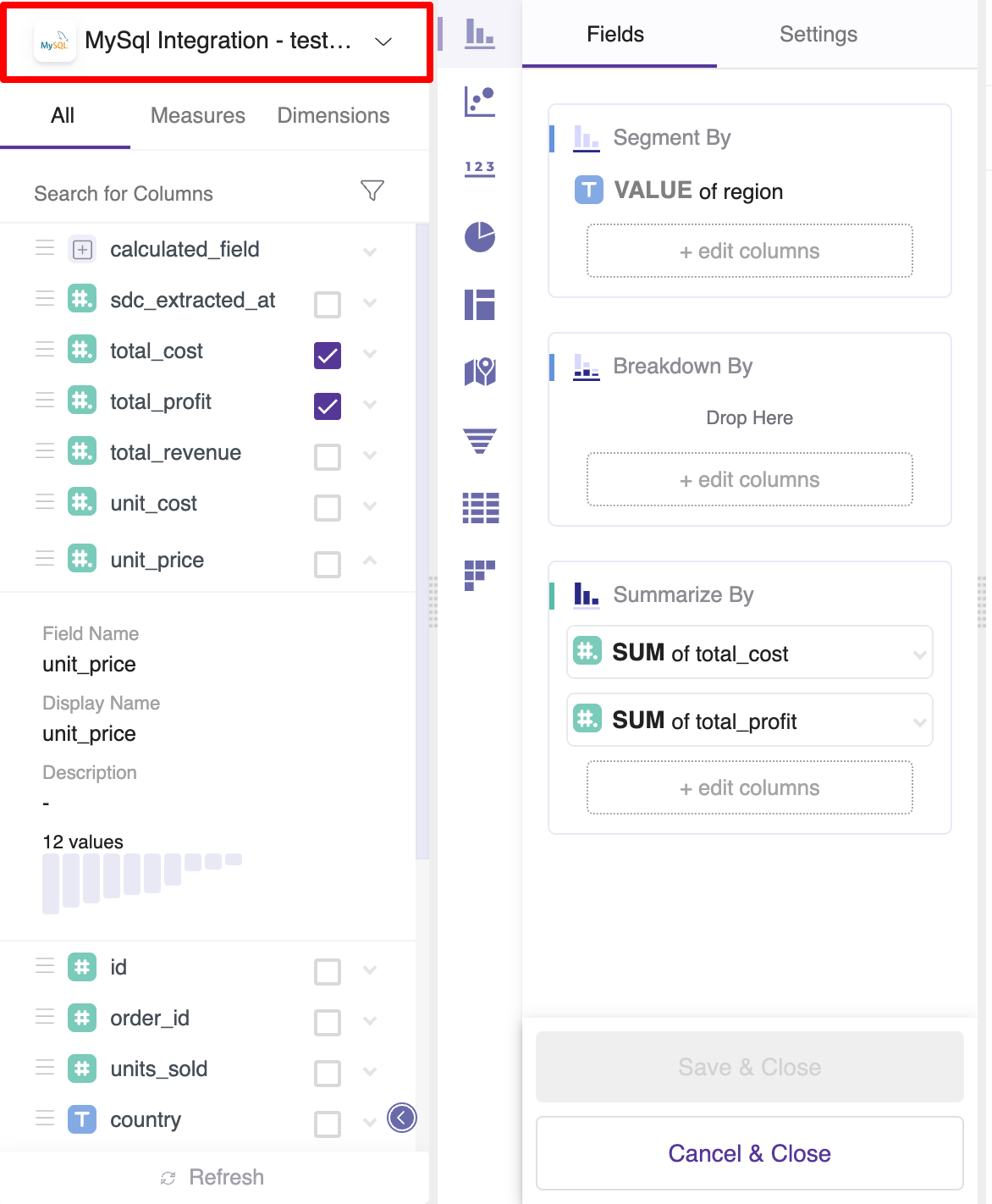
Change the underlying table used to create a widget.
Additional Field details
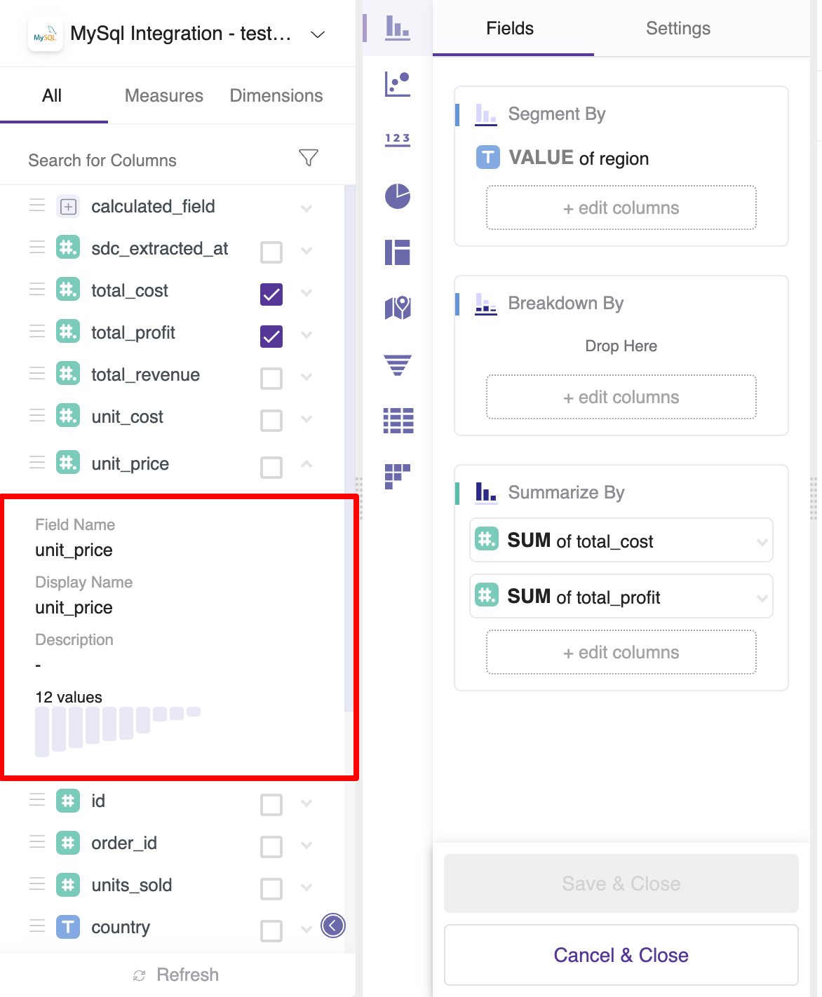
Field Name
The name of the field as used in the underlying table.
Display Name
The name of the field that will be used in charts and tables.
Description
A description or definition of the highlighted field. Often useful to describe how a measure was calculated.
Value Distribution Chart
See distribution histogram of a column's values. By placing a cursor on each bar, you will get information about names of unique values, as well as a count of each of them.
Refresh
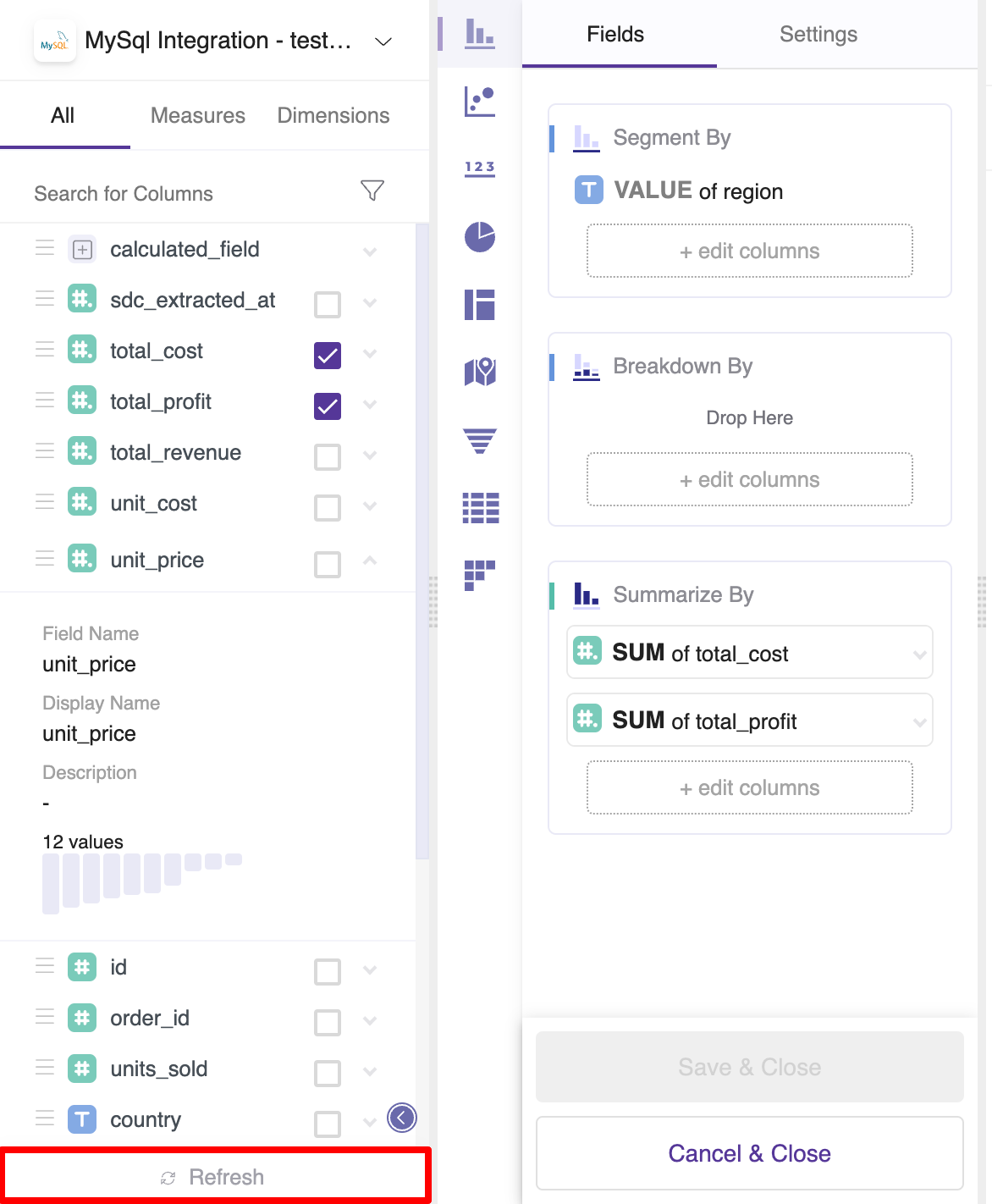
Refresh table to update available columns.
Add a calculated field
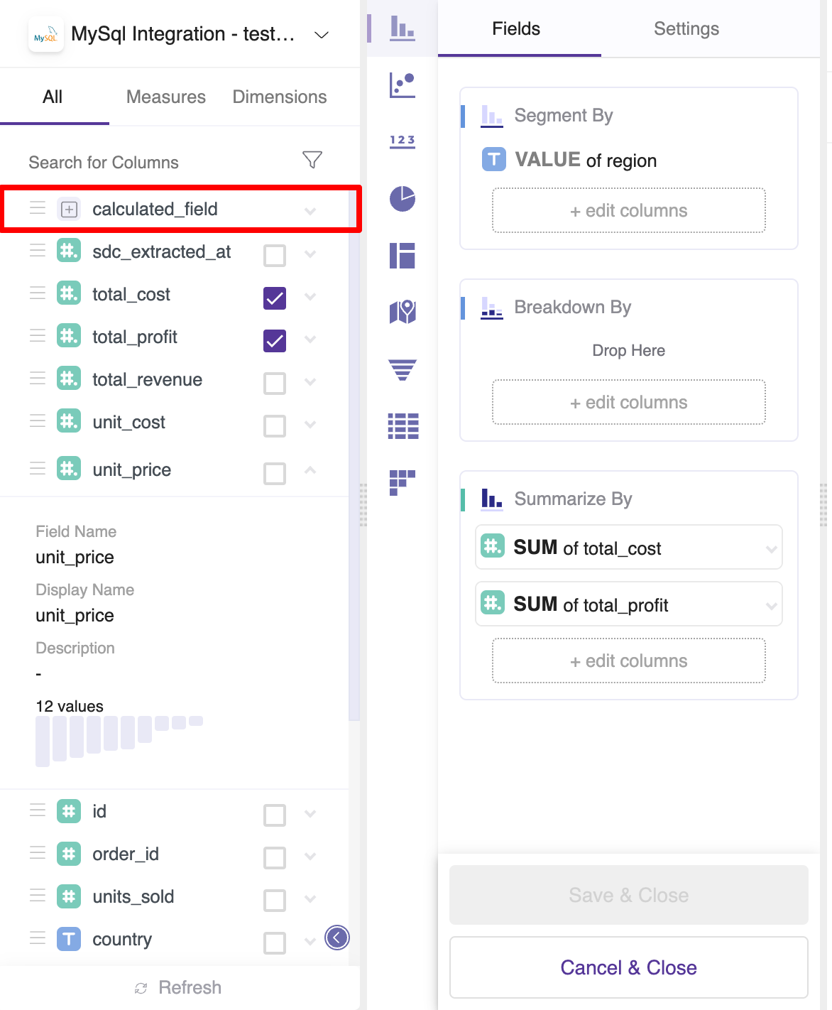
Drag a calculated field to any drop area to get started.
With Calculated Fields, you can create new columns which can be used directly in a widget. Since calculated fields are being calculated on run-time, the performance will always be inferior compared to creating a persisting column with the modeling layer.
See our guide on calculated fields for more information.
Select chart type
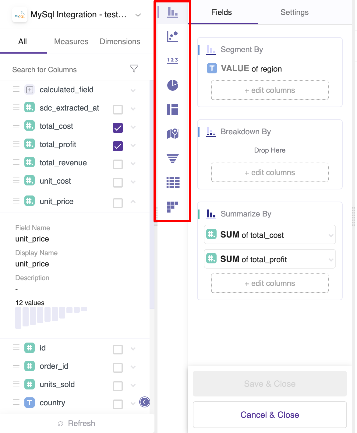
Select widget type to create a new chart. Currently, we support:
- Simple Chart
- Scatter Plot
- Number Box
- Pie Chart
- Treemap
- Geo Map
- Table
- Pivot Table
- Cohort Table
Add a field to a chart
Drag and Drop a field into a chosen drop area
Fields can be dragged using a mouse or trackpad from the field selection area into the drop area for a bin type (e.g. 'Segment by')
Auto-suggest drop area for a selected field
Selecting a field using the check mark (✅) will automatically suggest a fitting drop area (e.g. 'Summarize By') for that field.
Choose the drop area and then select a field
Using the '+ edit columns' control from within the drop area it is possible to select a field to add to that drop area.
Drop Areas
Segment By
Group results by this value. For example, Segment revenue by Year & Month would split your revenue to show the contribution of each month.
Breakdown By
Split your segments into smaller groups. For example, for each combination of Year & Month, break down spend into two smaller groups - Facebook and Google.
Summarize By
Within each group, use Summarize By to see the sum, count, average (and more) of a chosen column.
In tables, Summarize by can also be used to show the raw data for a chosen column in a non-aggregated form.
Size
Add a column that affects the size of each bubble. The larger the relative value is, the larger the size of a corresponding bubble.
Identifier
Add a column that identifies each member of a cohort - for example if this 1 cohort member = 1 company, this would be the company id.